Former Nintendo employees have shed light on why Kirby's appearance varies between the U.S. and Japan. Dive in to discover how Nintendo tailored Kirby for Western audiences and their evolving approach to global localization.
"Angry Kirby" Was Made To Appeal To Wider Audiences
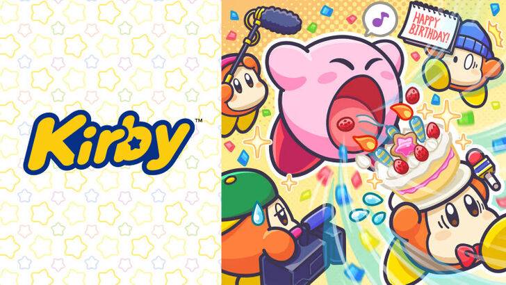
Nintendo Rebranded Kirby For More Appeal In The West
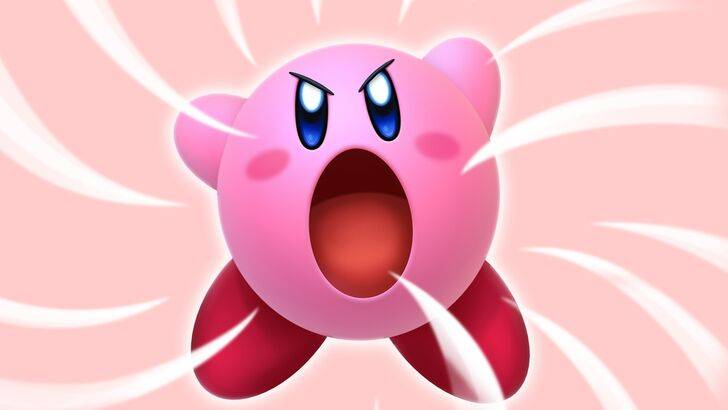
Kirby's fiercer look on game covers and artworks, dubbed "Angry Kirby" by fans, was designed to resonate with American audiences. Leslie Swan, former Nintendo Localization Director, discussed this shift in an interview with Polygon on January 16, 2025. She explained that while Kirby was not intended to look angry but rather determined, this change was made to appeal to American tween and teen boys who prefer tougher characters.
Shinya Kumazaki, Director of Kirby: Triple Deluxe, told GameSpot in 2014 that the cute version of Kirby attracts more players in Japan, while a strong, battling Kirby appeals more to U.S. audiences. However, he noted that the approach varies by title, as seen with Kirby Super Star Ultra, which featured a tough Kirby on both U.S. and Japanese box art. Kumazaki emphasized that while showcasing Kirby’s serious side through gameplay was important, the character's cuteness remains a significant draw in Japan.
Advertising Kirby As "Super Tuff Pink Puff"
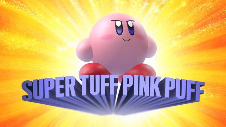
Nintendo's marketing strategy aimed to broaden Kirby's appeal, particularly to boys, leading to the "Super Tuff Pink Puff" campaign for Kirby Super Star Ultra in 2008. Krysta Yang, former Nintendo of America Public Relations Manager, highlighted a period where Nintendo sought to shed its "kiddie" image and embrace a more adult and cool factor. She stated, "Having a game that was labeled ‘kiddie’ was really a curse."
The focus shifted to emphasizing Kirby's combat skills rather than his youthful persona, a trend seen in the promotional materials for Kirby and the Forgotten Land in 2022. Yang noted, "There’s been a continued push to make Kirby into a more well-rounded character, but it’s true that most people still regard Kirby as cute versus tough."
Nintendo’s U.S. Localization For Kirby
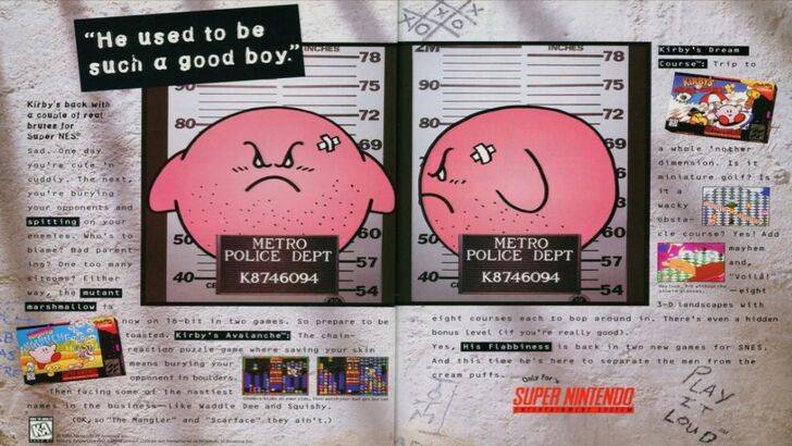
The localization differences for Kirby began with the 1995 "Play It Loud" campaign, featuring Kirby in a mugshot pose. Over the years, U.S. box art for games like Kirby: Nightmare in Dream Land (2002), Kirby Air Ride (2003), and Kirby: Squeak Squad (2006) showcased Kirby with sharper eyebrows and fiercer expressions.
Beyond facial expressions, Nintendo altered Kirby's color in the U.S. The original GameBoy release of Kirby’s Dreamland in 1992 showed Kirby in a ghostly-white tone instead of the pink hue seen in Japan due to the monochrome display. This changed with Kirby’s Adventure on the NES in 1993, where Kirby's pink color was introduced. Swan explained that a pink, puffy character wasn't appealing to boys trying to be cool, leading to further adjustments in U.S. box art to broaden appeal.
Recent global advertising has seen Kirby portrayed with varying expressions, from serious to gleeful, reflecting a more consistent approach.
Nintendo’s Global Approach
Both Swan and Yang noted that Nintendo has increasingly adopted a global outlook. Nintendo of America now collaborates closely with its Japan office to ensure more consistent marketing and localization strategies, moving away from region-specific variations like the 1995 Kirby advertisement.
Yang explained that this shift towards global marketing is a strategic move, but it comes with trade-offs. "It’s good and bad. Being global means consistency for the brand across all regions, but sometimes there is a disregard for regional differences," she said. This could result in "really bland, safe marketing for some of Nintendo’s products."
Game localizers attribute the current trend in localization to the globalization of the industry and the growing familiarity of Western audiences with Japanese culture, influenced by anime, manga, and other media.