The beloved plumber brothers, Mario and Luigi, almost had a grittier, edgier makeover in their latest game. However, Nintendo stepped in to ensure the game retained its signature charm. This article delves into the art direction journey of Mario & Luigi: Brothership, revealing an unexpected stylistic shift and subsequent course correction.
Early Development: A Rugged Reboot
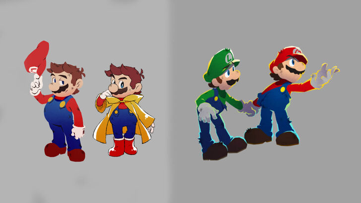
Initial concept art showcased a more rugged and edgy interpretation of the iconic duo. (See images below). However, Nintendo felt this departure strayed too far from the established Mario and Luigi aesthetic. The collaborative process between developers Acquire and Nintendo involved significant experimentation, leading to this initially darker visual style.
Finding the Balance: Preserving Identity
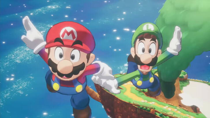
Developers from Acquire and Nintendo engaged in discussions to define the core elements of the Mario and Luigi identity. While Acquire, known for titles like Octopath Traveler and Way of the Samurai, initially leaned towards a darker, more serious style, they ultimately recognized the need to maintain the series' lightheartedness and accessibility. Nintendo provided crucial guidance, ensuring the final art style remained instantly recognizable to fans while still incorporating Acquire's unique design sensibilities. The final product successfully blended bold outlines and expressive animations, creating a visually distinct yet familiar experience.
A Collaborative Triumph
The development journey highlights the collaborative nature of game creation, and the importance of balancing creative vision with brand identity. While the "edgier" Mario and Luigi might have been intriguing, the final result—a vibrant, playful, and instantly recognizable game—ultimately proved to be a winning formula. The team learned valuable lessons about clarity and accessibility in game design, resulting in a brighter, more enjoyable experience for players.